Playing around with Sketch 3
Recently, on a whim, I decided to give Sketch a try. According to their website,
Sketch gives you the power, flexibility and speed you always wanted in a lightweight and easy-to-use package. Finally you can focus on what you do best: Design.
I was intrigued. I am a passionate app developer. But also a hobbyist. No matter how well versed you are with the Material Design Specification, your side apps simply cannot match the finesse and polish of a professionally designed app. And Photoshop is a mammoth. It has a steep learning curve. I have tried and failed several times in the past at trying to learn it.
The moment I fired up Sketch, I could feel how lightweight and agile it was. No slew of tiny controls on both sides of the screen. No giant lists of menu bar options. And also not a lot of confusing terminologies to remember.
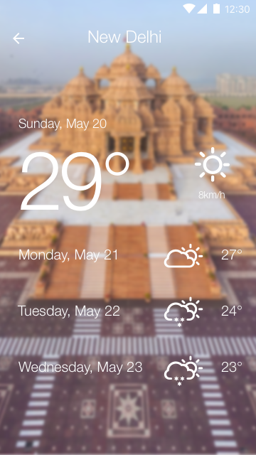
In the first couple of days I was able to come out with a bunch of good looking stuff. So here goes.
![]()


